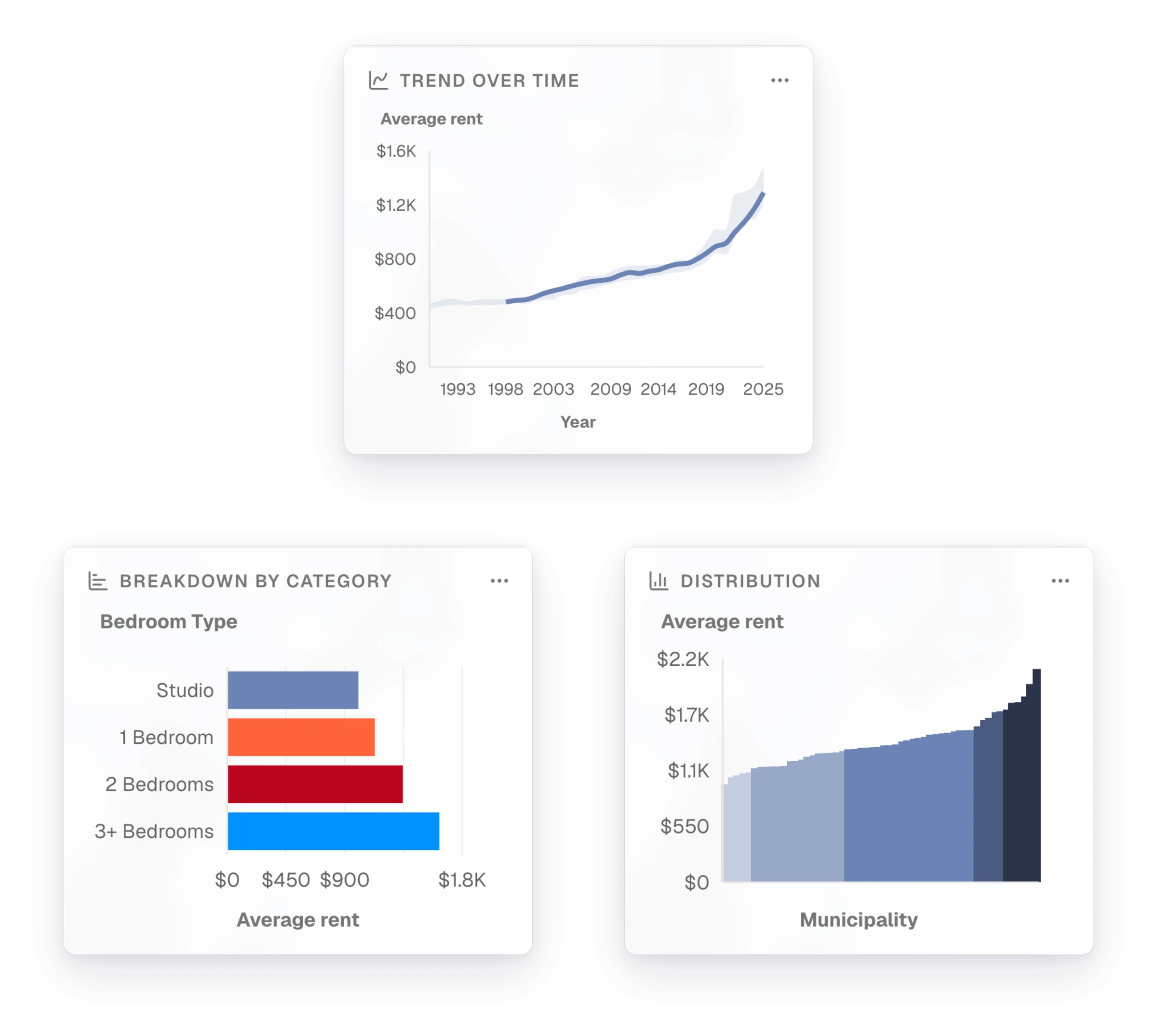
Open an indicator and the side panel now holds all of its charts, where it used to show one. For average rent in Montréal, that means the trend since the early 1990s, the rent for each number of bedrooms, and how the municipalities compare. The arrows above the chart step from one to the next. When you're writing a neighbourhood profile, you can see how a place compares with the region, and how it got there, without leaving the map.
Click a bar to find the place on the map
Click a bar in the distribution, and the map moves to the municipality that the bar stands for. It shows that municipality's value. If you then change the year or the scale, the chart and the map update together.
New1
OrganizationsNew organizations start with an example housing project set to their own region
Fixes4
ChartsAxes make room for their labels, so long category names stay whole
DataData loads again after a short outage that followed an update
OrganizationsColleagues invited to a team that signs in with single sign-on join it only once
DocumentsCovers can be edited on untranslated documents, and long indicator names show in full on hover